
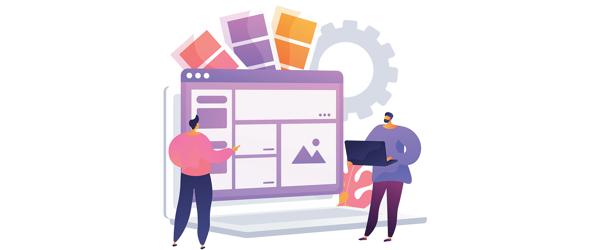
In 2021, your website appearance is equal to your business card. So, how it looks directly impacts your audience’s understanding of your brand’s prestige since people get used to internet shopping instead of window-shopping. A responsive web design leads to presenting well-organized content, improving your eCommerce website users’ experience, and boosting your sales. Here are the top tips to upgrade your website to be more professional through responsive web design.
Avoid Scrolling horizontally on your website
These days, people use their phones to visit any website more than other devices, highlighting cellphones’ critical role more than ever. One of the key elements in mobile-friendly websites is the way users scroll through your eCommerce website. Researches have demonstrated that vertical scrolling on your website is more manageable than horizontal scrolling for mobile users (Buchanan, 2012), impacting their experience after visiting your site and their buying behaviors.
Read more: 3 most important reasons for applying UX/UI design in mobile app development in 2021
Avoid Content Cluttering on your website
The easier the users find their answers, the more they are satisfied, thus impacting directly on your website users’ loyalty and your eCommerce website sales! It is up to your web design and how the site contents are organized to quickly guide the audience through the site instead of guessing the website interface process! How your website features affect user’s attractions are discussed below.
Using prominent buttons on your website
Suppose you focus on your website audience’s facilities. In that case, you have more control over the way the buttons appear on their devices. A well-designed site is one does not confuse its users. Your website readers must handle their requests in the fastest way unless they might give up and leave your website. What about your website features? Does it have specific “buy,” “book,” “order, “or “sign up” buttons?
My site is poorly designed! Help me now!
Using a straightforward, easy access menu on your website
A familiar designed website is much more efficient in easy navigation than an unfamiliar one (Nielsen, 2009). That is to say, to make a responsive web design, you should not forget that your website users get used to seeing the menu on the top, regardless of their devices. Unfortunately, in terms of web development, some designers misunderstand creativity with the poor UX leading to build an unfamiliar-designed website, running away the users.
Considering thumb-friendly website interface through responsive web design
In terms of website design, your website’s mobile users’ behaviors, experience, and satisfaction have been affected by your website. Since most people hold their phones with a single hand (Hoober, 2013), it is necessary to consider them while designing menus, buttons, lists, and other elements on your website. What are other behaviors you must know about your website users?
I have no idea! Give me a free consultation, please!
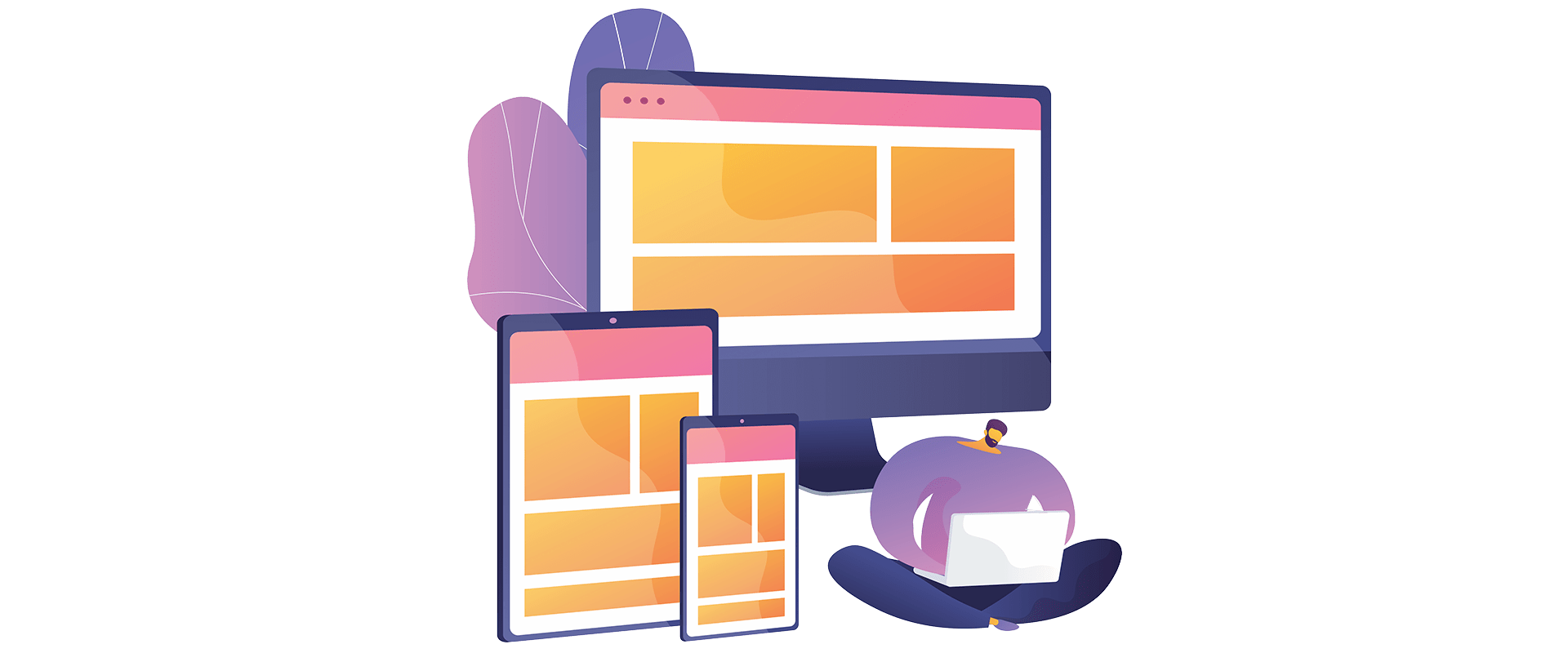
Focusing on your website target audiences’ platforms for the breakpoints
The breakpoints vary in web design based on your eCommerce users’ behaviors. In other words, to choose the point that your website appearance needs adaptions, it is critical to consider the target group’s main devices at the top of your priorities! For example, you can initially design a small size interface for your website then expand the site’s screen (Lepage & Andrew, 2019). For example, you are supposed to develop a new website like the knot wedding website. In this case, at first, you need to think about your target users. Who are they? Are they a group of suited bosses sitting in their office using a desktop and searching for wedding websites? Or perhaps they are young ladies laid down on a couch and googled the term using their cellphones?
So that, you should consider how your website interface looks on the mobile size and makes them responsive to laptop or PC size! Even you can go further and search for the most cellphone brands using the customers in your eCommerce area. Next, consider the specific size and design the website based on it, then adapt the interface to the other sizes! How much do you know your target group’s behavior? What are the main characteristics of your website users?
Using the best visual content for your website
Visual content plays a significant role in web design; the most prominent types are images that speak louder than words! Besides the UI UX tips dealing with images, two practical principles that affect your website, user experience, and buying behaviors, will be mentioned below. Accordingly, your audience engagement with your website will grow, thus enhancing your brand awareness and identity.
Optimizing images on the website
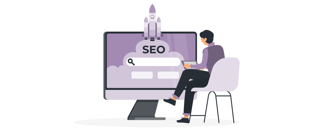
High-quality images are undoubtedly attractive and catch the users’ impression at the very moment visiting your website. However, those might be a threat to your website’s loading time. No matter how much you paid for digital marketing strategies, like social media marketing, to increase the website ranks through Google page speed or others. People don’t browse your site if it takes a decade to load! Here a free tool for optimizing pictures.
Applying max-width in Web Design
Have you ever experienced a situation like feeling stuck in a website, confusing how one can be fled due to a huge-sized image? A responsive website considers any size of viewports to avoid the challenge. While designing a website, it’s better to use max-width property instead of width and set it to 100%. It prevents images from magnifying to death. The width of images could rise to the maximum size of themselves, not anymore, yielding a better experience for your website users. There are so many videos on YouTube for the coding part to upgrade your website, although it might be time-killing for those who know little programing.
Hiring a design company to upgrade your website will save you time and money!
Conclusion:
Speaking of websites, there is no need to mention the importance of their visually appealing aspects. Although in some eCommerce owners’ view, the way a site will be attractive is limited to provide a handful of eye-catching images! This indeed risks your website, your identity, and page speed! Do you have a problem with your website loading time? Never late to mend; do something for it today! We are by your side.
Need a hand to save your identity? Your website? Let’s Go
References:
Buchanan, G. (2012). Chapter 13 – Mobile Access. In E. Buie, & D. Murray, Usability in Government Systems User Experience Design for Citizens and Public servants (pp. 205-215). London: School of Informatics. doi:10.1016/B978-0-12-391063-9.00045-6
Hoober, S. (2013, February 18). How Do Users Really Hold Mobile Devices? Retrieved from UXmatters: https://www.uxmatters.com/mt/archives/2013/02/how-do-users-really-hold-mobile-devices.php
Lepage, P., & Andrew, R. (2019, February 12). Responsive web design basics How to create sites which respond to the needs and capabilities of the device they are viewed on. Retrieved from the web. dev: https://web.dev/responsive-web-design-basics/
Nielsen, J. (2009, September 20). Fresh vs. Familiar: How Aggressively to Redesign. Retrieved from Nielsen Norman Group: https://www.nngroup.com/articles/fresh-vs-familiar-aggressive-redesign/